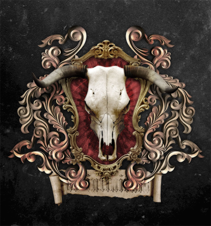
Follow this step by step design process of my latest photo manipulation piece of a detailed ornate heraldic style emblem. The design features a range of flowing ornamental elements that surround a mean looking steer skull. We’ll use various photo manipulation techniques along with some useful Photoshop tips to create a realistic and impactful design.

View large scale artwork
Most heraldic emblem designs you see across the web are usually created as vector illustrations, which look awesome, but I wanted to do something a little different and try and create a realistic emblem design using photo manipulation techniques. Instead of using hand drawn elements, the design is built using a range of stock photos. Simple cutting and pasting in Photoshop builds up the composition, while a few finishing touches blend in the tones and add a dark and grungy feel to the design.

I’d come across a range of fantastic artworks that inspired me to have a go at producing something along the lines of the ornate/baroque theme, with the heaviest inspiration coming from the master Nik Ainley from Shiny Binary. Many of Nik’s artworks use photographic resources to build a detailed and realistic looking design, which was exactly what I was aiming for (Check out Nik’s making of Mystic post over at PSD.TutsPlus). Other designs that tapped into the ornamental theme that I saved in my research folder were an illustration for Cure Apparel by Go Media and a design from Edmar Cisneros.

The initial idea I had was to create some kind of shield that was surrounded by a series of floral ornate elements. Within the centre of the shield would be some kind of cow or deer skull set against a radial flare of lines.

Being a photo manipulation piece the first step is to source a range of stock images. This can take up a huge portion of the overall project time as you can never find a stock image that matches the idea you have in mind! The main elements needed are a range of ornamental swirls. Try searching for antique frames, decorative sculptures and baroque type designs. I fell lucky with this high resolution photo of carved wooden frame elements from Shutterstock.

Open up your stock image and begin clipping out the objects. Use the Pen tool to draw smooth flowing lines. The technique I use is to click a point before a curve, add a point after the curve, then go back and add a point in the centre. Hold CMD (or CTRL for Windows) to toggle the Direct Selection tool and move the point into place.

Paste the elements into your main design document. I’m using a huge canvas size at 300ppi so I can print the design later should I wish. Paste in and rotate multiple versions of the element to build up a series of flowing ornaments.

Head back into the stock image and clip out another element. Keep your path a few pixels from the edge to avoid taking in parts of the background, then when you’re finished clipping right click and Make Selection. Once you’ve made a clipping path, double click it in the Paths palette and give it a name. This will save it so your next ‘Working path’ won’t overwrite your hard work.

Paste in a couple more elements and align them with the originals. Aim to continue the flow of the lines so each object blends together.

When you’re done, group all the objects (CMD+G) together. Duplicate the group, then right click and Flip Horizontally to create a perfectly symmetrical pattern.

Use a Hue/Saturation Adjustment Layer to remove some of the colour from the objects, then add a Levels Adjustment Layer to increase the contrast of the objects. CMD+Shift+Click on each object in both groups to create an outlining selection, then fill the layer masks of the two adjustment layers with this selection.

I downloaded a gold antique frame from Shutterstock for the next element of the design. Open the image in Photoshop to cut it out. With this image being set against white and being super high resolution we can cheat by using the Magic Wand tool. Remember to contract the selection (Select > Modify > Contract) by around 5px to make sure none of the background is taken into the selection.

Paste the frame into the centre of the design, then adjust the Hue/Saturation and Levels to match the tone to the original ornate elements.

The next object to clip out is a steer skull, again this image was sourced from Shutterstock. Unfortunately the only way to clip this image out is to get busy with the Pen tool, but if you rename your path and save the JPG the path will remain saved for any future projects you may need the image for.

Paste the skull and position it centrally on the design. The main portion of the head should fit inside the frame, but the horns can extend outwards to the outer edges of the design.

Adjust the Hue/Saturation and Levels once again to match the colour and tone of the skull to the rest of the design.

Double click the skull layer to add a Drop Shadow. Adjust the opacity to 100%, angle to 90 degrees and increase the Distance so you can clearly see the shadow underneath the horns.

Right click the effect in the Layers palette and select Create Layer. This will convert the drop shadow into a layer of its own, which you can then adjust using the shortcut CMD+T. Right click to select Warp, then bend the edges of the horns downwards to give the impression of depth where the horns are protruding outwards from the frame and casting a shadow onto the ornate elements.

Drop the opacity of the drop shadow layer to around 50% to tone down the effect just enough so it adds to the design but isn’t prominently noticeable.

None of my designs are complete without some kind of grungy texture, so a file from LostandTaken.com is pasted into the design and set to Soft Light. Changing the background colour of the document from black to a dark grey allows the texture to interact with the background colour.

Make a rough selection around the frame with the Polygonal Lasso tool and fill this layer with a deep red. This layer must be above the texture, but below the frame. Change the layer style to Color Dodge.

Quickly switch over to Adobe Illustrator to create a series of radial lines. Begin with a thin rectangle, Alt-Click a pivot point with the Rotate tool and enter 9 degrees. Press Copy, then repeatedly press CMD+D to repeat the transformation.

When last piece is in place, copy the whole radial pattern and paste it into your Photoshop document.

Squash and stretch the flare into place inside the frame. CMD+Click the thumbnail of the frame layer to load the selection, inverse by pressing CMD+Shift+I then use this selection to delete out any excess from the radial flare.

Invert the black flare by pressing CMD+I. This will change the pattern to white, then change the blending mode to Overlay to allow the background texture to show through.

Add a Drop Shadow to the frame layer to add some depth to the design. The shadow will darken the edges of the red overlay on the inside of the frame.

Use some ink stain Photoshop brushes to paint a rough border around the skull. Set the layer style to Overlay and reduce the Opacity to around 60%. Members can download this set of premium Ink Stain brushes from the Access All Areas section.

Load the selection of the ornate elements by CMD+clicking on any of the layer masks used in the design. Paint spots of red across the design with a soft brush.

Change this layer style to Color Burn at 50% to add a faded red colour cast to the design.

Repeat the process using a faded yellow over the frame, and a muted brown over the skull portion of the design. Change these layers to Soft Light and Color Burn respectively.

The yellow overlay on the frame adds a touch of gold, while the brown overlay on the skull darkens the shadows and brings out the textures.

The next element to add to the design is a tatty old scroll. The best scroll image I could find is this image from Shutterstock. Open it up and clip out the image from its background.

Cut out and paste individual portions of the scroll to create a banner. Use the main upper portion of the stock image, but blend in a roll from the opposite side and clean up the bottom edge.

Flip, scale and position this scroll underneath the main emblem design. Reduce the saturation and play with the Levels to match the tone to the rest of the document.

Load the selection of both the ornate elements and the frame to create a layer mask on the scroll. To give the impression that the scroll is folding back over the ornate elements, carefully draw around the tips of the rolls and remove this selection from the layer mask.

Paste in some random text as a motto for the emblem. Here I’m using a Blackletter font to match the theme of the design.

Change the layer style to Overlay and use a rough Photoshop brush to fade out portions of the text with a Layer Mask.

The main composition and layout of the design is just about complete, but let’s add a couple of cool visual effects to finish off the design. Press CMD+A to select all, CMD+Shift+C to copy all layers then CMD+V to paste this copy on top of the layer stack. Add a Gaussian Blur of around 15px.

Set this blur layer to Darken in the Layers palette. The blur effect merges with the original details to create a surreal mix of both realism and a kind of hand-drawn illustrative style. Adjust the prominence of the effect by lowering the opacity to around 80%.

Paste in another copy of the design, this time go to Filter > Other > High Pass. Adjust the slider until the details emerge from the grey background, then change this layer to Linear Light and lower to 70%. This high pass brings back some of the sharp details that were lost to the blurring.

The mix of both the blur layer and the high pass gives a cool final effect to the design which helps bring out the tiny details and textures.
Download the source file